The painting has painted border which top is arched.
Recently I noticed that this arch is important key to understand Seurat's method of composition.
This curve looks the same as the curve of raised hem of the skirt and the curves of the legs side by side.
The arc model can check how the curves are.
Only five types of circles are enough to make the model.
This creates harmonious effect.
Seurat [Cancan] arc model
Circle-arc model can be made extending arc-model.
Seurat "Cancan" circle-arc model
Enlarged model show how exactly the circles are placed.
Seurat "Cancan" enlarged circle-arc model
Blue circles make the basic structure.
Seurat "Cancan" blue circle-arc model
The two circles which are the extension of the arch pass near the bottom corners.
The circles which make the hem of the skirt intersect higher than the painting.
Seurat [Cancan] circle-cross model
The second largest red circles are dominant.
A circle with the horizontal and vertical diameter make a unit called circle-cross unit.
When more than three circles intersect at a point I call the point"pivot".
Circles fastened at a point can still be moved along the point for adjusting balance.
Lined units make good balance.
Seurat"s late composition is highly syntactic.
Syntax is ornamental.
I have classified the level of ornamental development into seven.
The highest level of work can be expressed as circle-cross model.
The most syntactically finished work by Cezanne is lithograph "Six Bathers" which is linear work.
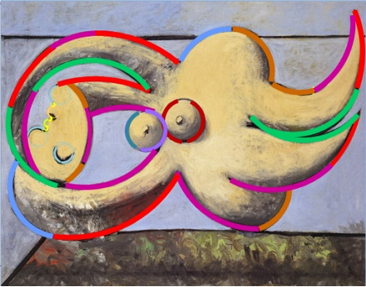
Picasso started monochromatic Cubism.
Even Fauvist Matisse painted "Dance" with a few colors.
Early Modern artists all recognized that atom of art is arc.
any artwork is based on innate universal grammar and syntactic devices. therefore analyzable geometrically
squares 1~5
Saturday, June 15, 2019
Thursday, May 23, 2019
Mondrian did not use golden ratio but integer ratio for proportion
I picked up this illustration from the previous blog "How to make Mondrian."
This suggests that I could express all the Mondrian in the big eyed grid.
I have read about Mondrian's use of Golden Ratio very often.
I searched in (Golden Ratio. Mondrian).
It seems that his use of Golden Ratio is accepted with no doubt.
I found one suitable blog to point the problem: [Katari-e no Sekai].
....[Your painting is made of squares only.]
Mondrian answered that I see no squares.
There are only Golden Squares.
There are two accompanied illustrations
The left illustration is recognized as Golden Rectangle as it is divided to squares.
I do not see Golden Rectangles in the right picture.
I see all the rectangles are different as Mondrian said.
I used soft "paint" to extract the rectangle.
Then I changed the size to find suitable one for grid.
The rectangle 8/5 is near perfect match:
8/5=1.8 ( Golden Ratio is 1.618)
The Mondrian on the right is expressed on grid.
Mondrian started Chinese Lattice-like work with four different rectangles.
The next type does not have regular units but looks like installed shelf;
rectangles with same width piling up
and rectangles with same height lining on horizontal line.
A large almost-square appears near center.
Cabinet likeness disappears: all the rectangles are attached to the frame.
I picked works of high resolution for checking.
10/8
9/9
15/12
32/16
31/20
23/21
25/21
31/31
37/36
75/76
This suggests that all his works can be designed on regular grid when the good digital images are available.
Relatively small number of grid eyes is enough to design Mondrian composition, which is why the proportion clearly recognizable.
There is great consequence in the use of simple grid.
A) Historical art is applied art.
Pure art does not depend on the current art history.
It can be created on the innate sense ability.
B) golden ratio was used as temporal fashion.
On the other hand the visual grammar is innate ability of all human.
Recognition of natural number is not mathematical but pre-mathematical perception.
The grammar is the base of all intellectual activity including mathematics.
Mondrian re-discovered the visual grammar after following Cubism.
Saturday, April 20, 2019
[Sharaku is Hokusai] 1 Geometrical technique for drawing a face by Sharaku
Old man's face by Hokusai and face part of [Miyakoza] by Sharaku
This is the illustration from the previous blog [Who is Sharaku?].
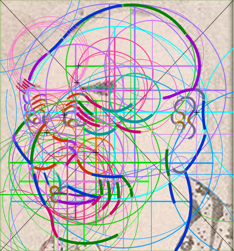
Both faces are made of arcs of limited number of circles.
(I call this method scaling technique.)
After finishing a series of [Who is Sharaku?]
I started the analysis of Picasso work in 1932.[Picasso's geometrical spirit in 1932 invented syntactical deice]
I found out that his most refined level of technique is expressed as circle-cross model.
Arc is atom of art.
The arcs in artwork can be extended to circles.
The circles can be balanced as unit of the circle, the horizontal and vertical diameters.
The face of [Miyakoza] looks to be designed minutely, which reminds me of old men in [Hokusai Manga].
So I made the circle-cross model of both faces.
the detail of [Miyakoza] by Sharaku circle-cross model
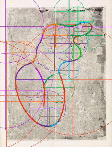
old man from [Hokusai Manga] by Hokusai manga
There are some technical similarities.
A) use of scale:
[Miyakoza] 10 circles, [Manga] 9 circles
B) larger units make the basic structure.
C) the straight lines longer than the diameters show lining of units which have the effect of balance.
D) most of the rippling wrinkles are made of the same sized circles which are bundled at a point.
With these similarities it is hard to say that Sharaku is not Hokusai.
Wednesday, April 10, 2019
Masterpiece always has ingenious geometrical structure [Mikaeri Bijin] by Moronobu
The basic structure of architecture is hidden.
The structure of ornament is visible.
Painting has both the basic and surface structure.
Only the contour is seen but the hidden basic structure is effective.
[Mikaeri Bijin] by Moronobu is well known as masterpiece in Japan without convincing critical explanation.
Words are not suitable for art theory.
I devised a model.
Moronobu [Mikaeri Bijin zu] circle-cross model
The outline of the picture is made of a chain of limited number of curves.
The bents of the curves looks to be deliberately chosen.
To confirm, I made the circle-cross model (units of a circle , the horizontal and vertical diameters).
The larger seven units ( blue, pink, red ocher, green, purple) make the basic structure.
The details can be seen better in the enlarged version.
I could not draw the details with arcs only because the digital image is not clear enough.
I own a reproduction with better resolution.
Moronobu [Mikaeri bijin no zu] enlarged circle-cross model
On the top horizontal line the three units are placed.
The largest dark green unit makes three lines of the left sleeves.
One of the second largest blue units makes lower part of kimono knot
and another blue unit makes the side of the hair.
The blue units are the main components of of the upper body.
The third largest pink circles make the lower part of the kimono.
The fourth largest brown circles are used for details.
The green arcs are used most dynamically.
The purple circles are used all over from the back head to the hem of the kimono.
I made the overlapped diameters thicker to show the relation of the units.
Moronobu [Mikaeri bijin no zu]
It is obvious that the overlapped diameters make the structure balanced well.
Moronobu drew pictures of more than hundred picture books.
He did not have to start from drawing real kimono figures.
He could see hundreds of traditional drawings as samples .
Drawn kimono figures are very linear curved shapes unlike real kimono.
Until the end of his career
his technique reached the highest level which I call the seventh level of ornamentation.
In the blog [Who was Sharaku?]
I have written that Hokusai possibly mastered Soutatu's method of circle-stencil method to invent Sharaku .
The another possibility is that Hokusai studied early Ukiyo-E paintings by Moronobu or Kiyonobu for Sharaku style.
The structure of ornament is visible.
Painting has both the basic and surface structure.
Only the contour is seen but the hidden basic structure is effective.
[Mikaeri Bijin] by Moronobu is well known as masterpiece in Japan without convincing critical explanation.
Words are not suitable for art theory.
I devised a model.
The outline of the picture is made of a chain of limited number of curves.
The bents of the curves looks to be deliberately chosen.
To confirm, I made the circle-cross model (units of a circle , the horizontal and vertical diameters).
The larger seven units ( blue, pink, red ocher, green, purple) make the basic structure.
The details can be seen better in the enlarged version.
I could not draw the details with arcs only because the digital image is not clear enough.
I own a reproduction with better resolution.
On the top horizontal line the three units are placed.
The largest dark green unit makes three lines of the left sleeves.
One of the second largest blue units makes lower part of kimono knot
and another blue unit makes the side of the hair.
The blue units are the main components of of the upper body.
The third largest pink circles make the lower part of the kimono.
The fourth largest brown circles are used for details.
The green arcs are used most dynamically.
The purple circles are used all over from the back head to the hem of the kimono.
I made the overlapped diameters thicker to show the relation of the units.
Moronobu [Mikaeri bijin no zu]
It is obvious that the overlapped diameters make the structure balanced well.
Moronobu drew pictures of more than hundred picture books.
He did not have to start from drawing real kimono figures.
He could see hundreds of traditional drawings as samples .
Drawn kimono figures are very linear curved shapes unlike real kimono.
Until the end of his career
his technique reached the highest level which I call the seventh level of ornamentation.
In the blog [Who was Sharaku?]
I have written that Hokusai possibly mastered Soutatu's method of circle-stencil method to invent Sharaku .
The another possibility is that Hokusai studied early Ukiyo-E paintings by Moronobu or Kiyonobu for Sharaku style.
Tuesday, January 22, 2019
How modern was Cezanne syntactically?
There is no history in pure art.
When art-historical time is shown on horizontal ax, the quality of artwork appears on vertical ax.
The artistic quality which depends on the geometrical structure is measurable quantitatively.
I have shown in the blog [Cezanne's intuitive syntax and Modigliani's intentional syntax] that the syntactic structure in Cezanne can be explained using models.
Last time I made new model called circle-cross model.
This time I am going to check if the new model can be made for the same work: [Six Bathers].
Cezanne [Bathers]
This is most finished work among Cezanne's whole works.
The contour without volume makes easy to see the design.
Cezanne [Six Bathers] lithograph arc model
This is mostly made of arcs.
I used only seven circles for the arcs.
I add the vertical and horizontal diameters to each circle for making a unit.
Cezanne [Six Bathers] circle-cross model A
To see better, I thicken the line segments which are lined.
Cezanne [six bathers] lithograph circle-cross model B
Many diameters of the units are lined, to my surprise.
(I quote from the previous blog.)
A picture usually started for drawing animal and human shapes.
The shapes always become simplified.
There are several steps in formalization of drawing.
The artists' awareness of shape develops like these:
1) A string of line is made of a chain of curves each of which has different curvature.
2) A curve with a single curvature is an arc.
3) The circles which are the extension of the arcs can be easily adjusted to have balance.
4) The number of circles should be small to be harmonious.
5) The crossing point( pivot) of the circles is important for harnesing.
6) The pivots on a line makes unified look.
7) The unit of a circle and vertical-horizontal diameters makes easier to control the whole balance.
It is almost unbelievable that Cezanne invented such device.
But any design develops in the same way.
The process can be called embellishment of design.
The syntax is the device for embellishing a design.
Refining the design of a picture is making it ornamental.
This process can be seen in any style of artifact.
There is no difference between artist and artisan.
They use the same syntax.
Thursday, December 13, 2018
Arp's shape is very formal
As scientific art theory is a hypothesis, only the analysis of each work can confirm itself.
So far I have shown that Sharaku( Hokusai) and modern artist like Matisse, Picasso, Klee,and Modigliani used the same compositional technique called circle-cross method.
Arp was a Dadaist and Sur-realist who also made organic abstract art.
His method of automatic drawing is well known but some works seem to be very formal.
Any work tends to become refined with clear shape when the same pattern is drawn repeatedly.
Arp in later years made a portfolio [Toward the infinite White].
As it seems that each work has no title I made provisional titles for them.
(ancient Venus)
Arp [Toward the infinite White]
Though the image is like a statue,
the shape on the format is very balanced.
The effect must come from the hidden structure.
It can be confirmed by the circle-cross model.
Arp [Toward the infinite White] circle-cross model A
The largest orange red units make the curves of the thighs.
The unit which covers most of the area is the basic.
On the horizontal diameter of this unit,
1) the purple unit is placed attaching the large circle inward.
2) the three units (green, purple and sky blue) touch one another vertically.
On the vertical diameter of the same unit,
1) the green unit is placed,
2) passing the center of the green unit, a blue purple unit is placed on the left
and the orange unit is attached on the left.
The three units are lined horizontally.
(Two human figures)
Arp [Toward the infinite White]
On sign level we see two human figures overlapping.
We can see some geometrical characteristics without the aid of models.
1) The top human figure has five concave and the bottom human figure has four concave.
2) There is one straight segment in the top shape and three in the bottom shape.
3) Both of the contours are made of a few curves in different curvatures.
4) Some of the curvatures look the same.
5) Two top convexes in top shape are smaller .
The largest unit has two different hues for explanation sake.
1) These lines written below intersect at one point;
the extension of straight line segment in the top figure
the orange red circle for the right side arm of of the top figure
the orange red circle for the left side of the head of the bottom figure
the red circle for the right arm of the top figure
2) The purple unit is on the vertical diameter.
Another purple unit is attached at the right side and on this horizontal line the red circle for the right side of the head of the top figure is attached.
(face without eyes)
Arp [Toward the infinite White]
This is typically organic abstraction.
Arp [Toward the infinite White] circle-cross model]
I made the second largest unit in two colors.
The two intersecting darker pink units are lined vertically.
They are passing the center of each.
The two intersecting brighter units are lined horizontally on the horizontal diameter of one of the largest brown units.
The horizontal diameters the pink units are on the horizontal diameter of of another brown unit.
The bottom loop inside the large loop is made of horizontally lined units ( blue, yellow green and yellow).
[Three larvaes ]
Arp [Toward the infinite White]
Though the surface line looks rough, the basic structure is very geometrical.
Arp [Toward the infinite White] circle-cross model]
The largest unit (yellow ocher) is basic.
1) Yellow green circle and pink circle are passing the center of the unit.
2) Another yellow green unit is on the horizontal diameter.
The two pink units making the tail part of the bottom shape are overlapping horizontally.
The lower part of the same shape is made of the same sized unit (pink).
On the vertical diameter of this unit, two pink units are placed.
One is attached to the bottom pink unit and green blue unit is intersected with the top pink unit.
Alfred Bar's diagram shows that modern art converges to two: non-geometrical abstract art, geometrical abstract art.
As the non-geometrical abstract art was originated from Dada and Sur-realism in the diagram, Arp's organic abstract art is classified as non-abstract art.
The notion that every living thing are made of cells made unified biology.
Likewise the fact that every artistic shape are made of arcs can unify artworks.
Artists became aware that the drawing usually becomes a chain of a few curves when they drew a simplified shape.
There is no such difference between organic shape and abstract shape.
The reason why such difference became important is that Euclid geometry has been required subject at school for long period.
Archimedes's method of measuring area of irregular shape: slicing the shape into thin rectangles and the top and bottom pieces as triangles.
This type of geometry is more general.
The most basic thinking is neither verbal nor literal but visual.
I searched images online for difference between organic and geometric shape.
and I found so many illustrations, among which I chose one.
So far I have shown that Sharaku( Hokusai) and modern artist like Matisse, Picasso, Klee,and Modigliani used the same compositional technique called circle-cross method.
Arp was a Dadaist and Sur-realist who also made organic abstract art.
His method of automatic drawing is well known but some works seem to be very formal.
Any work tends to become refined with clear shape when the same pattern is drawn repeatedly.
Arp in later years made a portfolio [Toward the infinite White].
As it seems that each work has no title I made provisional titles for them.
(ancient Venus)
Arp [Toward the infinite White]
Though the image is like a statue,
the shape on the format is very balanced.
The effect must come from the hidden structure.
It can be confirmed by the circle-cross model.
Arp [Toward the infinite White] circle-cross model A
The largest orange red units make the curves of the thighs.
The unit which covers most of the area is the basic.
On the horizontal diameter of this unit,
1) the purple unit is placed attaching the large circle inward.
2) the three units (green, purple and sky blue) touch one another vertically.
On the vertical diameter of the same unit,
1) the green unit is placed,
2) passing the center of the green unit, a blue purple unit is placed on the left
and the orange unit is attached on the left.
The three units are lined horizontally.
(Two human figures)
Arp [Toward the infinite White]
On sign level we see two human figures overlapping.
We can see some geometrical characteristics without the aid of models.
1) The top human figure has five concave and the bottom human figure has four concave.
2) There is one straight segment in the top shape and three in the bottom shape.
3) Both of the contours are made of a few curves in different curvatures.
4) Some of the curvatures look the same.
5) Two top convexes in top shape are smaller .
The balance of the two shapes is so good that I guess the two were designed at the same time.
The circle-cross model can confirm it.
Arp [Toward the infinite White] circle-cross model BThe circle-cross model can confirm it.
The largest unit has two different hues for explanation sake.
1) These lines written below intersect at one point;
the extension of straight line segment in the top figure
the orange red circle for the right side arm of of the top figure
the orange red circle for the left side of the head of the bottom figure
the red circle for the right arm of the top figure
2) The purple unit is on the vertical diameter.
Another purple unit is attached at the right side and on this horizontal line the red circle for the right side of the head of the top figure is attached.
(face without eyes)
Arp [Toward the infinite White]
This is typically organic abstraction.
Arp [Toward the infinite White] circle-cross model]
I made the second largest unit in two colors.
The two intersecting darker pink units are lined vertically.
They are passing the center of each.
The two intersecting brighter units are lined horizontally on the horizontal diameter of one of the largest brown units.
The horizontal diameters the pink units are on the horizontal diameter of of another brown unit.
The bottom loop inside the large loop is made of horizontally lined units ( blue, yellow green and yellow).
[Three larvaes ]
Arp [Toward the infinite White]
Though the surface line looks rough, the basic structure is very geometrical.
Arp [Toward the infinite White] circle-cross model]
The largest unit (yellow ocher) is basic.
1) Yellow green circle and pink circle are passing the center of the unit.
2) Another yellow green unit is on the horizontal diameter.
The two pink units making the tail part of the bottom shape are overlapping horizontally.
The lower part of the same shape is made of the same sized unit (pink).
On the vertical diameter of this unit, two pink units are placed.
One is attached to the bottom pink unit and green blue unit is intersected with the top pink unit.
Alfred Bar's diagram shows that modern art converges to two: non-geometrical abstract art, geometrical abstract art.
As the non-geometrical abstract art was originated from Dada and Sur-realism in the diagram, Arp's organic abstract art is classified as non-abstract art.
The notion that every living thing are made of cells made unified biology.
Likewise the fact that every artistic shape are made of arcs can unify artworks.
Artists became aware that the drawing usually becomes a chain of a few curves when they drew a simplified shape.
There is no such difference between organic shape and abstract shape.
The reason why such difference became important is that Euclid geometry has been required subject at school for long period.
Archimedes's method of measuring area of irregular shape: slicing the shape into thin rectangles and the top and bottom pieces as triangles.
This type of geometry is more general.
The most basic thinking is neither verbal nor literal but visual.
I searched images online for difference between organic and geometric shape.
and I found so many illustrations, among which I chose one.
Visual Arts: Organic and geometric shapes
visualartspdsf.blogspot.com
These two organic shapes in the illustration can easily drawn with a chain of arcs as they are drawn simplified.
Cezanne's apples are more consciously made of a few arcs as he sought for balance.
The difference between organic shape and geometrical shape is the number of curves we identify on the contour of shape.
Subscribe to:
Posts (Atom)